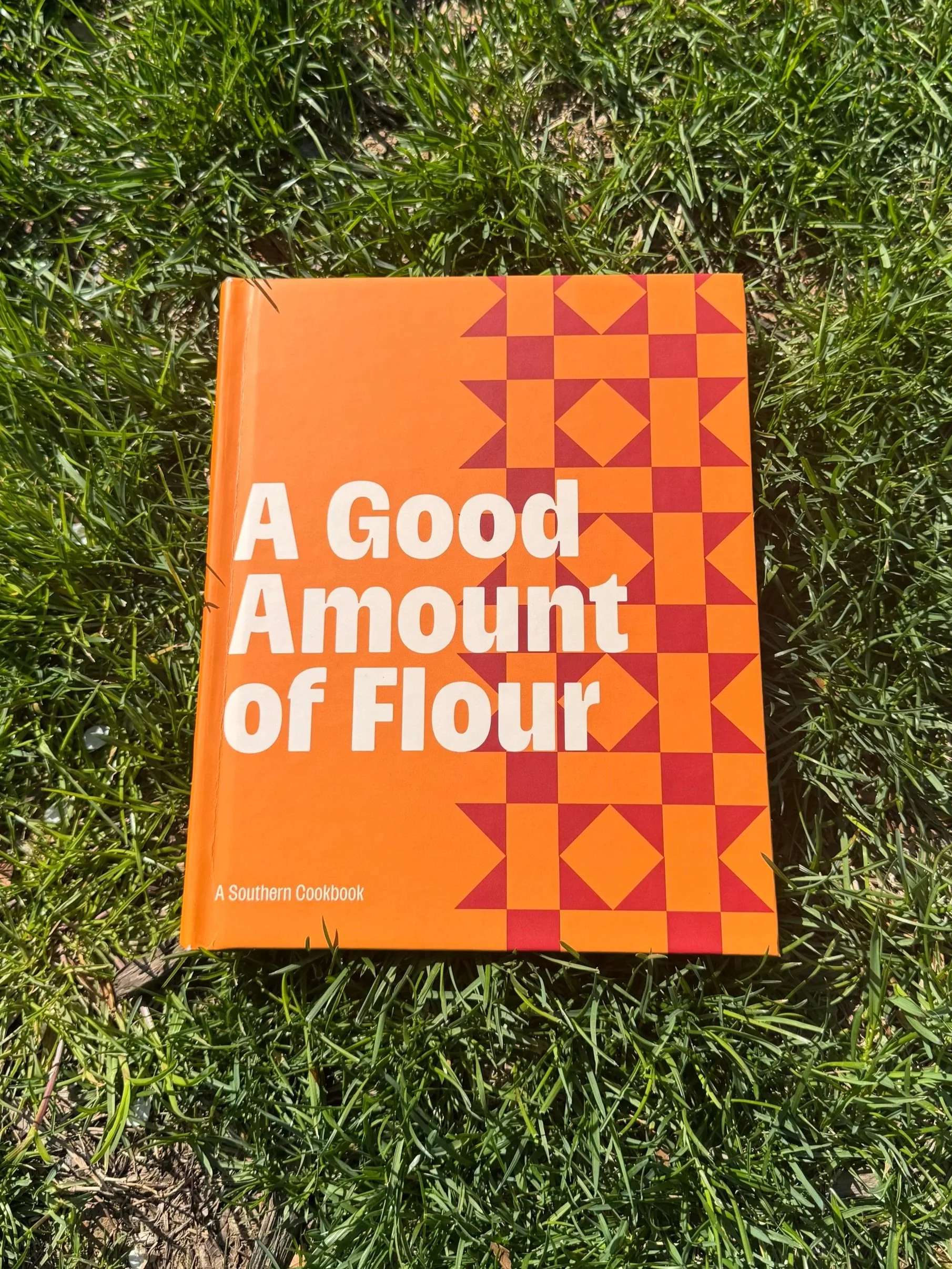
A Good Amount of Flour
OverviewInspired by African American quilt-making and feelings of home and comfort, comes A Good Amount of Flour, the cookbook. Heavily inspired by my grandmothers and summers in Alabama, I wanted this book and its exhibition to feel like a warm hug.
Style Guide

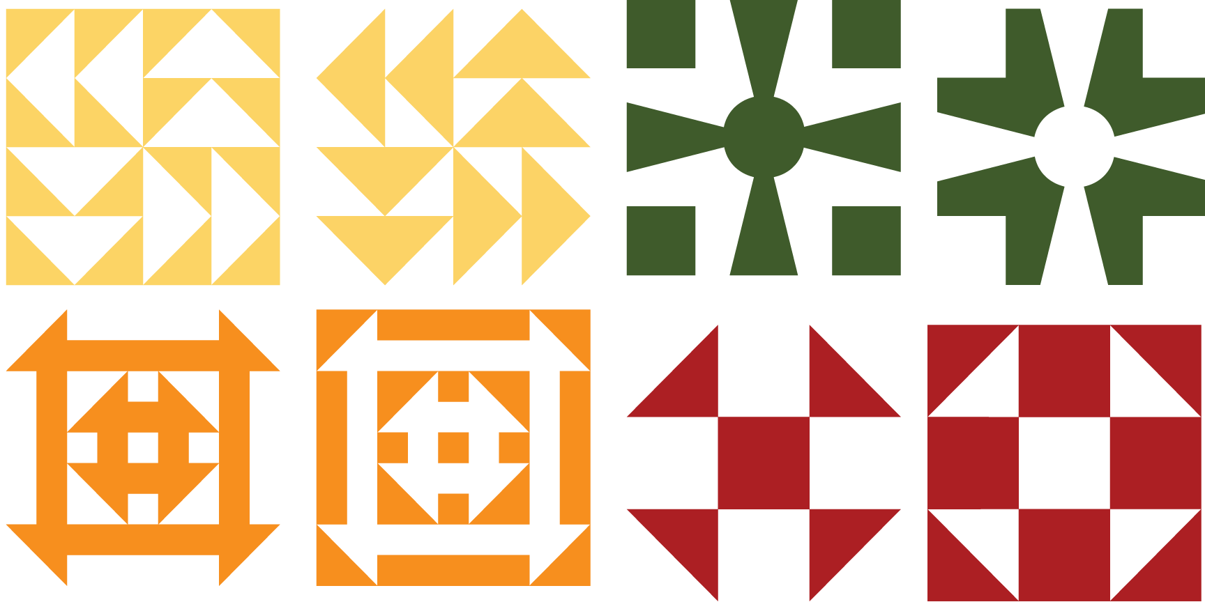
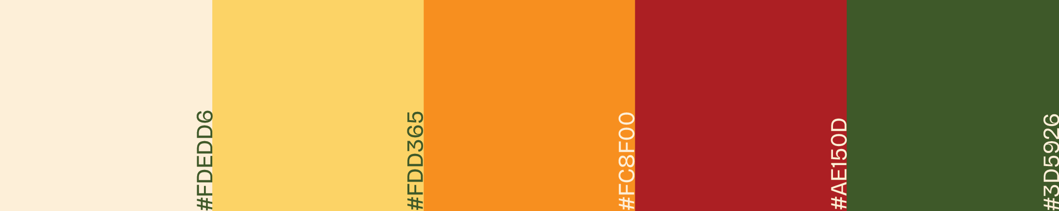
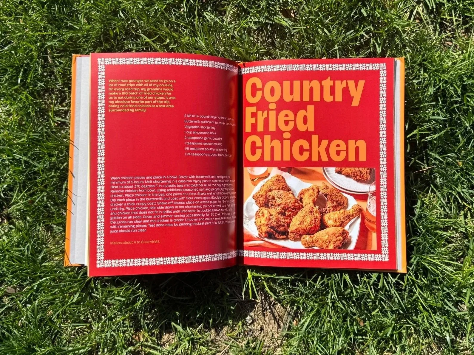
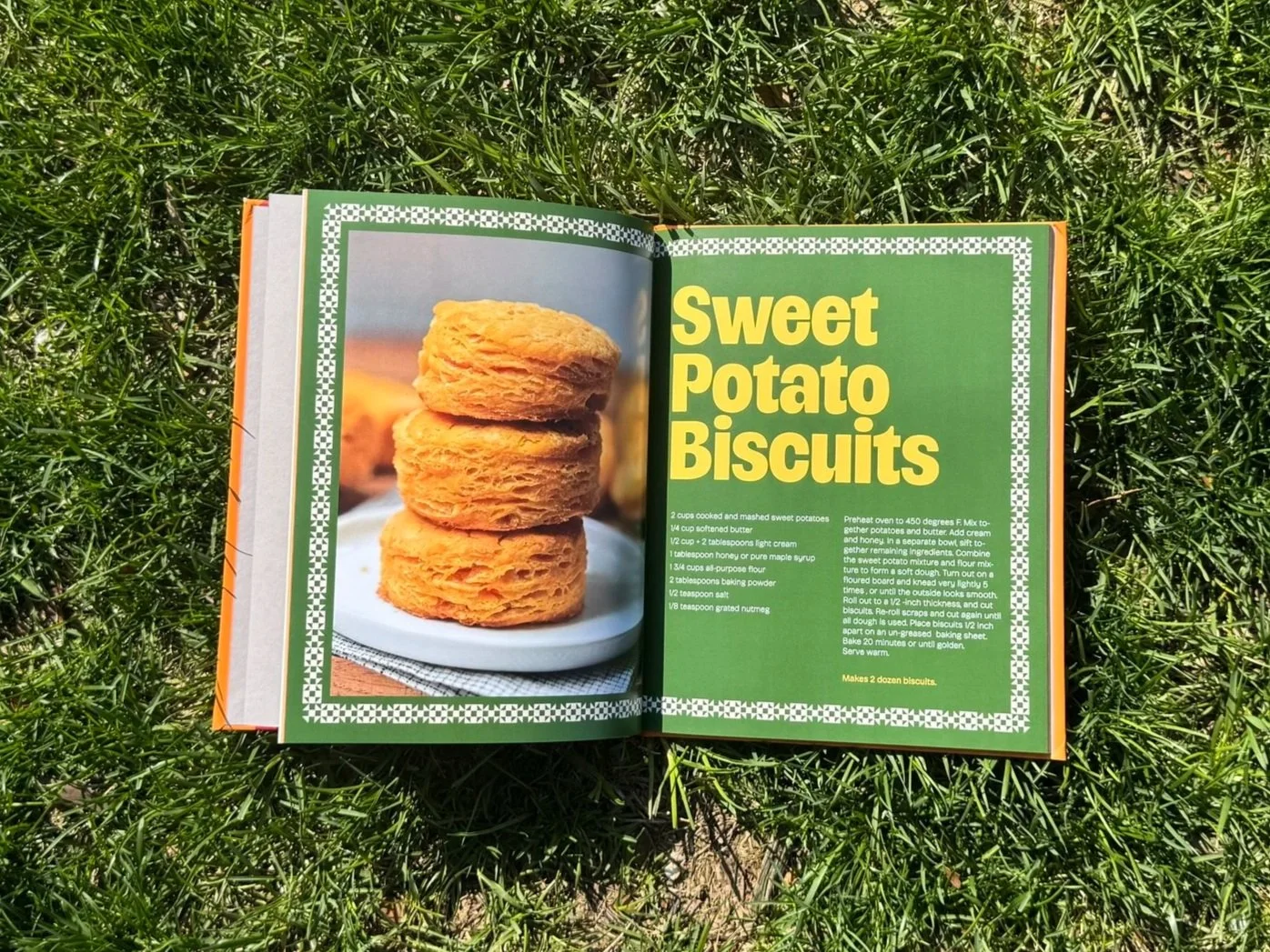
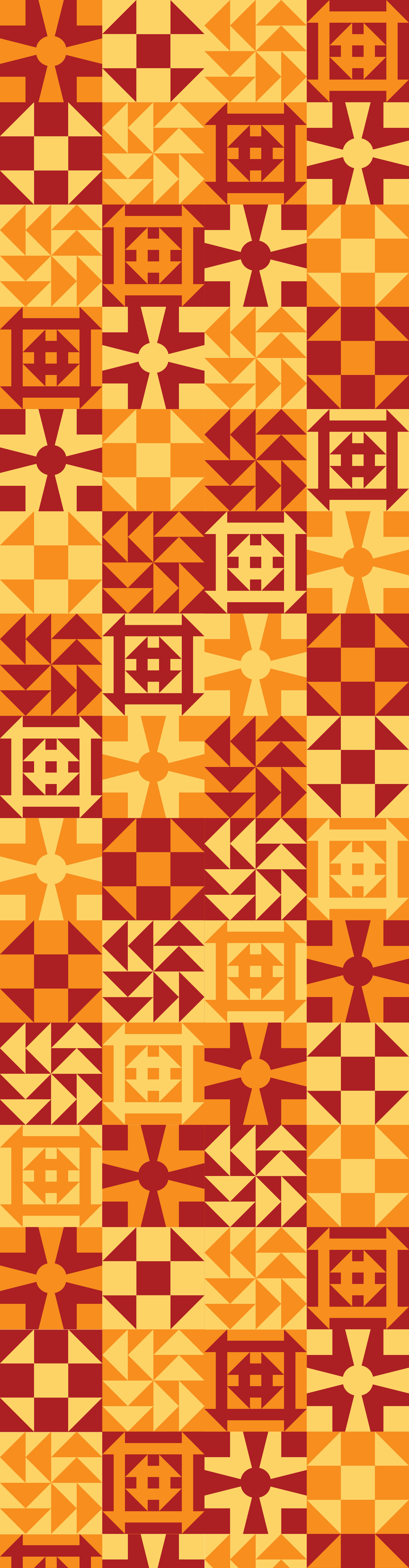
Visually, I wanted to create a book that was beautiful. I utilized Harriet, a typeface by Tre Seals, as the border of the recipe pages. The typeface resembles quilts, which ties back to my African American Heritage. I tested a lot of different color palettes. I wanted the book to feel warm and inviting. The colors used are all warmer tones that feel very comforting.
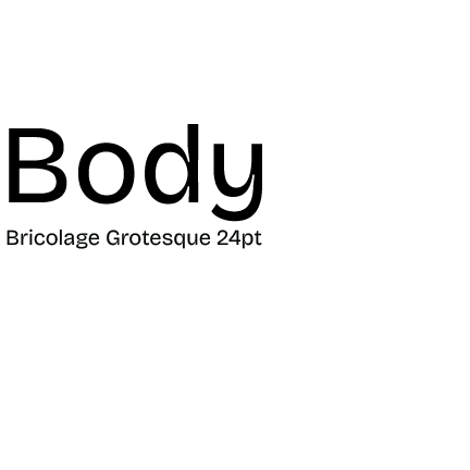
As for the text, I wanted it to be edgy and visually interesting and not a cliché cookbook. Please VF is the typeface that I used for the headings and subheadings; it is bold and really beautiful when large on a page. For the body type, I used Bricolage Grotesque 24 pt, a very quirky typeface with a lot of personality. I wanted to use a font that was not only functional but really beautiful, and that’s what I found with Bricolage.